Quartet
UX Design • Design System
Winter 2025
At-A-Glance
Job seekers in their early to late 20s in Seoul, South Korea, particularly first-time job applicants, face several obstacles in their career preparation journey.
Quartet is a digital platform designed specifically for Generation MZ (Millenial and GenZ), providing:
Streamlined career preparation tools
Digestible, actionable insights
Personalized guidance
User-friendly experience
My Role
UI/UX Designer – Specializing in Interaction Design, Visual Design, and Prototyping
Work-in-Progress Project
Team Structure
Team Leader / PM: Yeonkyeong
Front-end: Yeeun
UI, UX Designer: Michelle
Back-end: Jeongyun, Jihye, Hyunje
Timeline
Seoul, KR / Washington, DC
(16-hour time zone difference)
Jan 2025–ongoing
Tools
Figma
IntelliJ IDEA (Java)
Discord, Notion: Collaboration
Claude (AI)
Papago (Korean AI Translator)
The Challenge
Job seekers in their early to late 20s, particularly first-time job applicants, face several obstacles in their career preparation journey:
Difficulty tracking and managing various certification deadlines and job application timelines
Lack of centralized information about industry-specific certifications and their value to employers
Challenge in finding reliable resources for self-improvement and career development
Need for personalized guidance in choosing the right certifications based on career goals
Information overload from multiple sources leading to decision paralysis
The Solution
As the sole designer, I designed wireframes and helped turn it into a digital platform that streamlines the job preparation process for new graduates in Seoul. The platform's design emphasizes clarity and efficiency, helping users make informed decisions about their career preparation while reducing information overwhelm.
Centralized Dashboard
Intuitive calendar interface for tracking certification deadlines and job postings
Popular certification rankings and trending job postings
Customizable profile system that tailors content to user's career interests
Certification Management
Detailed certification pages with key information (pass rates, preparation time, validity)
Integration with YouTube tutorials and study resources
Employer preference indicators showing which companies value specific certifications
Email notification system for important deadlines
Background
I was invited to collaborate on a side project by a Korean colleague in Seoul, focusing on developing a platform to assist recent graduates in navigating the job market and efficiently searching through professional certifications. We operate across different time zones (Seoul & DC), meeting through Discord and documenting our progress in Notion.
Collaboration
My primary collaboration was with the front-end engineer, concentrating on critical design elements including:
Color system development
Typography selection
Interactive component design
User interface consistency
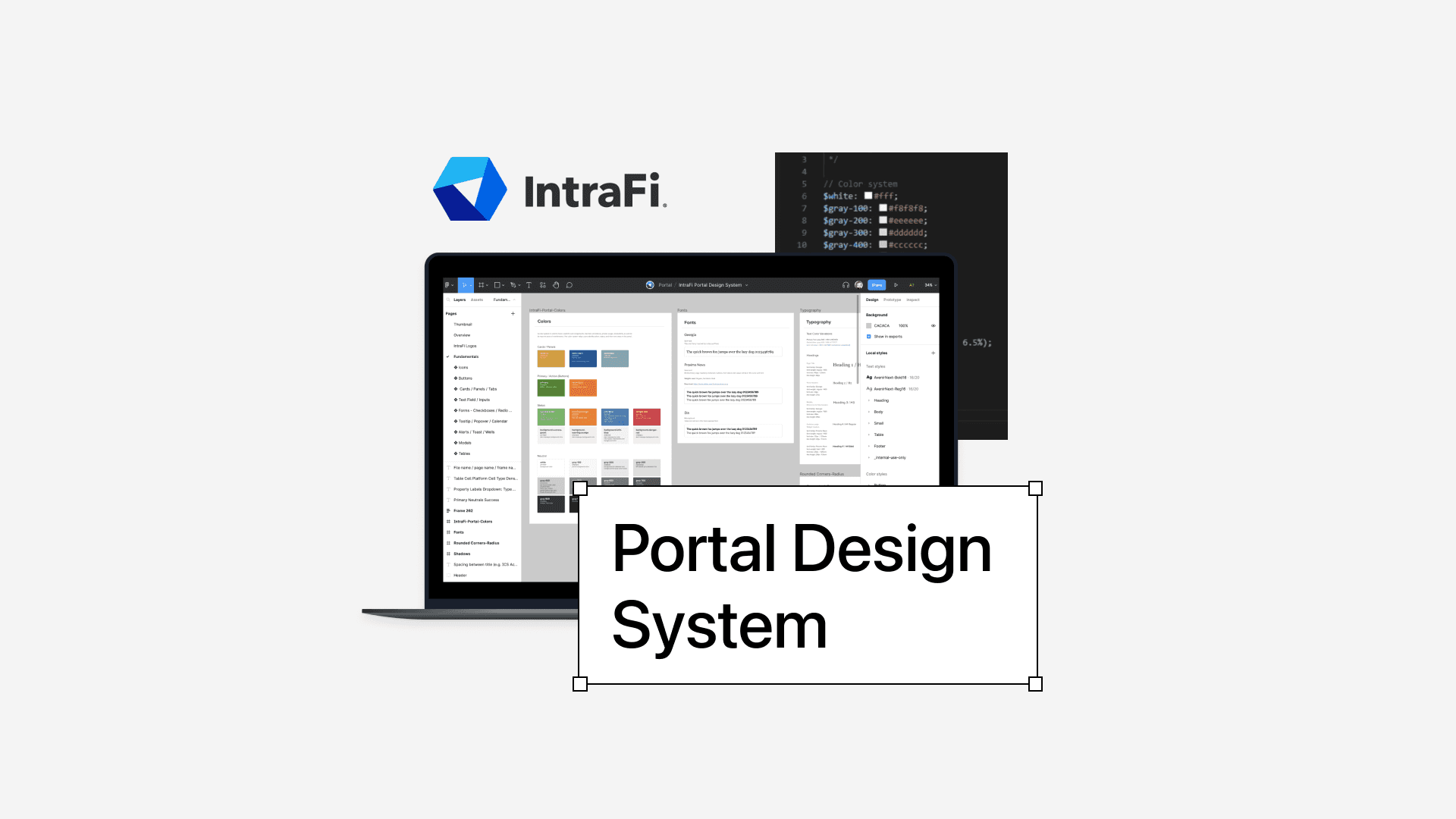
Initially, we considered implementing Storybook.js for component management. However, due to budget constraints, we opted to create a comprehensive design documentation system within Figma, ensuring detailed visibility into our design language and component specifications.
Research and Inspiration
Our team conducted extensive competitive analysis, studying existing job hiring and certification platforms to inform our design strategy. This research was crucial in defining our platform's unique value proposition.
Research about Generation MZ (Millenial-Gen Z)
Articles are in Korean language, turn on translate to read the articles.
What is the most important selection criterion for the MZ generation when it comes to employment?
About the characteristics of MZ generation employment and changes in employment trends
Wireframes
Homepage
(translated version and description to come)
Desktop version
Mobile version

My Profile
(translated version and description to come)
Desktop version
Mobile version

Calendar Page
(translated version and description to come)
Certification Page
(translated version and description to come)
Certification Details Page
(translated version and description to come)
Login Page
(translated version and description to come)
Login available through: Naver, Kakao, and Google.
Design
Designing Components with Figma
The design system consists of foundations, components and patterns.
Foundations (aka Fundamentals) - establishes the basic brand standards such as the typography, color, spacing, shadow, icons. It makes up the initial experience.
Breakpoints
It is important to establish what breakpoints are necessary in the beginning of the project.
Reflection
Communication Challenges
As a non-native Korean speaker with elementary language skills, effective communication presented an initial challenge. By leveraging translation tools like Papago and collaborating in other ways (through Notion, Discord, Figma), we successfully bridged communication gaps. This collaborative approach allowed for nuanced idea exchange and mutual understanding.
Key Learnings
Technical Korean terminology (e.g., 자격증 "certification")
Cross-cultural design collaboration techniques
Adaptive communication strategies
Navigating design decisions in a multicultural team environment
The project has been an enriching experience, allowing me to contribute my design expertise while learning from the team's fresh and innovative perspectives.


