IntraFi Portal Design System
UX/UI • Design System
2021–2023
At-A-Glance
IntraFi partners with over 3,000 banks across the financial industry, specializing in helping institutions manage customer funds, optimize cash balances, and enhance profitability through its diverse financial solutions. The company assists in managing large deposits by distributing them across multiple banks, ensuring each deposit remains within the $250k FDIC insurance limit.
My Role
UI/UX Designer – Interaction Design, Visual Design, Prototyping
Team Structure
2 in-house designers (including me)
2 UX design contractors in Romania
Software engineers
Product manager
Timeline
Arlington, VA & Romania
(7-hour time zone difference)
May 2021– Sep 2023
The Problem
The Transaction & Reporting Portal is where institutions manage transactions and access operational reports and tools (referred to as "the Portal" throughout this case study). During an initial UI audit, I found that the Portal faced significant inconsistency issues, and the overall experience felt disconnected.
The design system is the single source of truth containing a set of visual decisions and standards, which groups all the elements that allows teams to design, realize, and develop a product. It is intended to provide guidance when using common patterns or styles in IntraFi Applications.
ISSUES FOUND:
Inconsistent styling of fonts and components
Duplication of existing components
Misuse of colors
Outdated design - moved classic pages to rebuild
Accessibility issues across the site
The Solution
Business:
Improve communication with cross-functional teams making it easier to test and develop user interfaces.
Have a better understanding of customers.
Meet goals faster and at a lower cost.
Help onboard new designers and cross-functional teams.
Design:
Ensure consistency, usability, and accesibility in the Portal.
Keep code and design in sync to have a more efficient design/development process (worked with developers).
Made visual suggestions for improvement. (e.g. navigation bar icons, color choices and brand cohesion.
Design
Designing Components with Figma
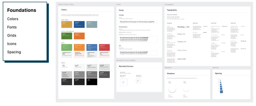
The design system consists of foundations, components and patterns.
Foundations (aka Fundamentals) - establishes the basic brand standards such as the typography, color, spacing, shadow, icons. It makes up the initial experience.
Components - includes foundational and with other components such as checkboxes, radio buttons, toggles, label inputs and outputs, etc.
Using Plugins to Save Time
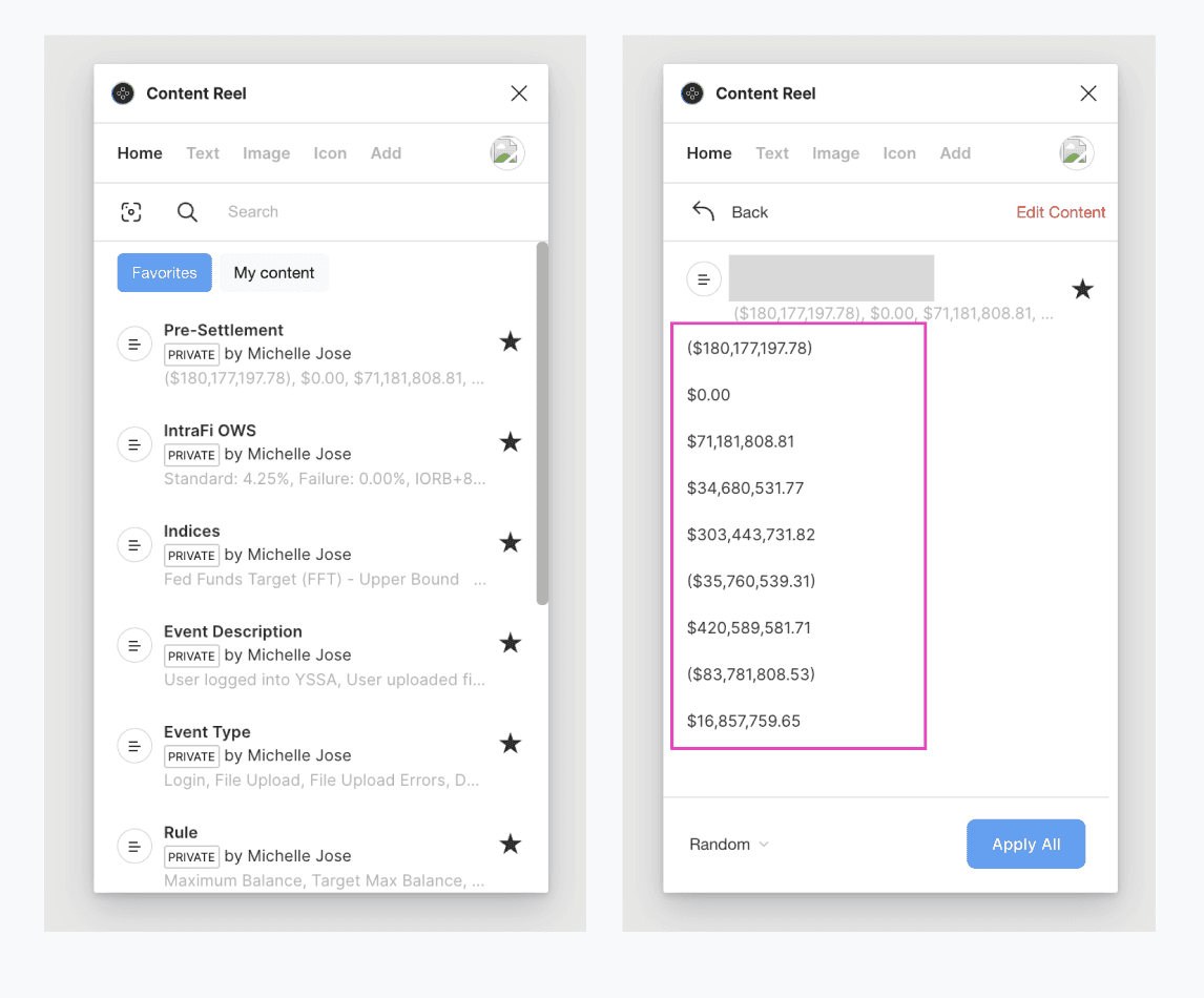
Since we primarily use financial data, it was time-consuming to mock up a page or use Lorem Ipsum as placeholders. While not using real data, we still wanted our mockups to be as realistic as possible when testing prototypes with users. To address this, I explored plugins and discovered Content Reel. For instance, since we use a lot of data tables, I could select entire columns and input placeholder data using this. This plugin helped maximize efficiency and saved us many hours during while designing.
Accessibility
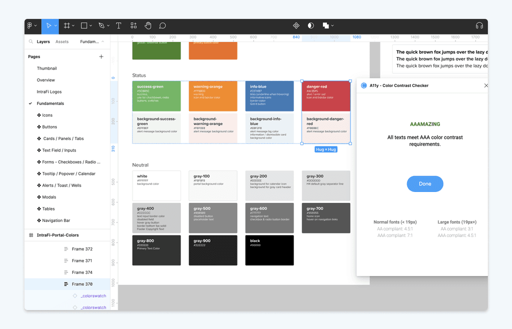
I conducted accessibility testing to ensure compliance with WCAG guidelines. All elements passed the contrast checker with the help of the A11y plugin and adhered to WCAG 2.1 guidelines.
Along with the software engineer, we improved the front-end UI by reducing color duplications. The color system helps us ensure we have a consolidated palette of accessible colors. Now that we have a design system in place, future designers and developers now have a reference to go to.
User Testing
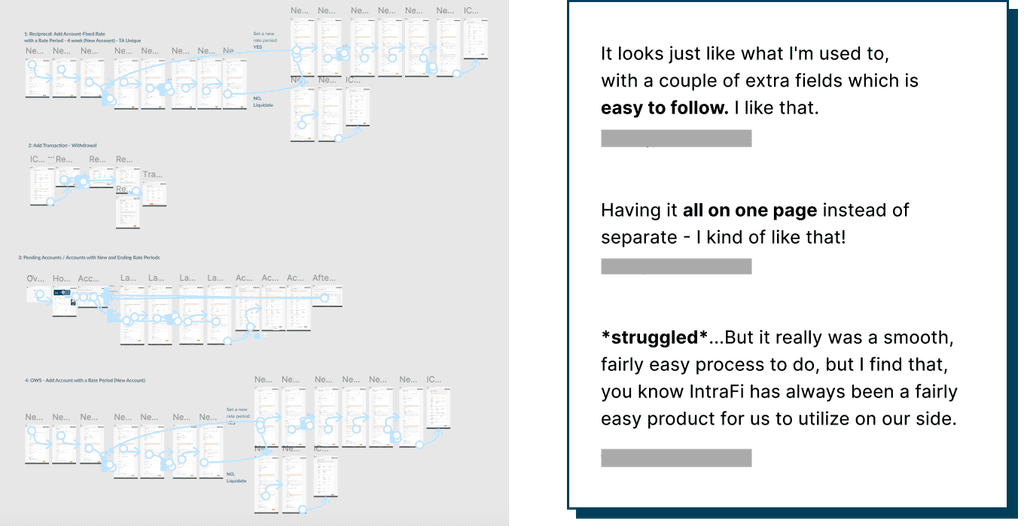
During the initial user testing for the fixed-rate feature—another project I took on when a designer left the team—I created prototypes in Figma and observed how bankers interacted with them. I actively listened to their feedback, noting their issues and pain points. Their valuable insights guided me in creating improvements and additions to the design system that I might have otherwise missed.
A/B Testing + Iterations
I conducted A/B testing with internal users and provided weekly updates on the portal screens to the team. This involved sharing progress and making design iterations based on feedback.
In Production
One of the features I enhanced was the password reset user flow. I added a show/hide password icon and the password requirements with a visible checklist.
Post-SVB Failure
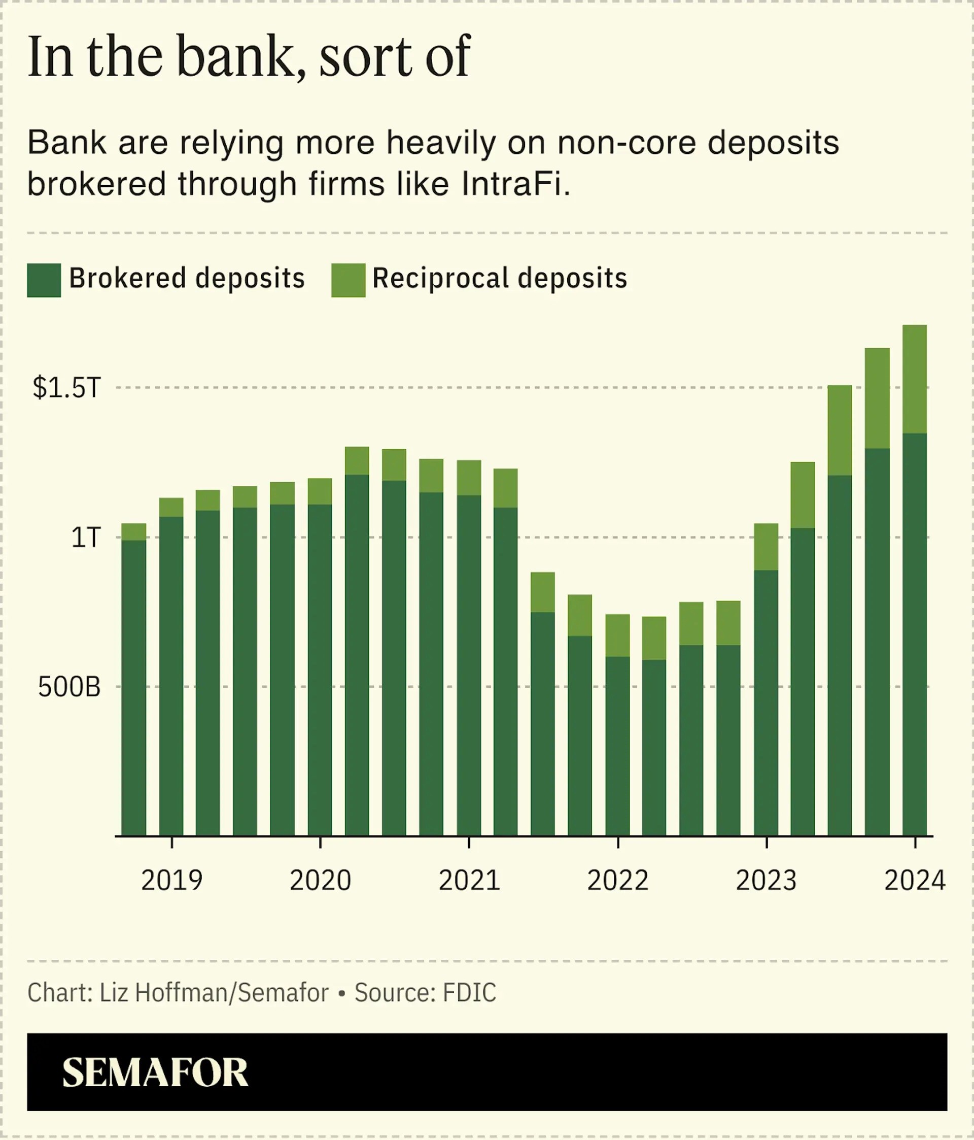
Around March 2023, Silicon Valley Bank (SVB) failed, which highlighted vulnerabilities in the banking system. This made a lot of customers more selective about where they deposit their money. Due to this, IntraFi had a surge of users come in. As the company experienced growth and attracted new banks and customers, a streamlined and user-friendly design system is essential.
Having the design system not only enhanced the onboarding experience for new users, but also made it faster for designers to design prototypes for new features. It also supported IntraFi's continued growth and efficiency.
Article: How one company made bank off the regional banking crisis
Reflection
Design Handoff + Next Steps
Before I left, I worked closely with engineers to validate the design implementation and with the UX designers on brainstorming in Miro and planning to documentation in Zeroheight.
If I had more time, we also planned to use Google Analytics to track key data metrics, which would help identify the areas of the portal that are performing well versus those that might need improvement.
Limitations
Since I wasn’t the original designer, I can only refer from the UI audit and not make drastic design changes. Coming from a visual design background, I always had aesthetics in mind, but this time around, I had to adapt my mindset into prioritizing what the goal is, such as "which components does the team use the most? Are the alert messages consistent across the portal? Will the user see this? Is the data table information easy to navigate, etc." There were many questions to consider for the customers and internal users. For this case, the visuals can be improved little by little during the process.
what I learned
When it comes to products that are already built like the Portal, there are some limitations I have to take note of. I need to make the wise decisions on what is the best for the user experience. Research and user testing is very helpful in making those decisions. This experience helped me grow as a designer. Always putting the customer's needs first is essential to ensure a seamless experience. Sometimes, the design may not be perfect, but if it's functional and it helps the user get from point A to point B, then it serves its purpose. In this case, I learned to prioritize usability and accessibility before aesthetics.
In summary
Implementing a design system has significantly improved communication with cross-functional teams. This helped us better understand our customers and achieve our goals faster.
The design system, much like a product, helps build other products and serve as a single source of truth. Without a shared language, teams can’t create effectively together. It also streamlines the onboarding process for new team members.
Moreover, it also keeps code and design in sync, leading to a more efficient development process. This allows designers to focus more on prototyping and enhanced our overall collaboration. Ultimately, improving the user experience and consistency across the portal.
